Artwork and Website Spring Cleaning
Over the weekend, I decided it was high time for some art-related spring cleaning. I’ve had a few things on my organizational “to do” list for quite a while, and what better time to get to it than a month long quarantine? The project involved two main tasks that actually evolved into three, and each project sort of naturally transitioned into the next. The first task I set out to accomplish was organizing my original, paper copies of artwork. I’ve used Itoya Original brand portfolios for years, but a couple of them have become very unorganized. And I’ve never made effective use of the spine inserts.

Fortunately, I already had some MS Word mock-ups for spine inserts. They weren’t very good aesthetically, but at least I had the measurements in place so I could just edit and print inserts that would actually fit. I have four books dedicated to my usual portraits, one for my more cartoonish kid’s book artwork, two for the kids’ artwork, and another for work-related certificates/awards/etc. Eight total seemed like a lot, but I actually had to order more portfolios because I need at least one more for incomplete art and miscellaneous things.
I was pretty satisfied with the paper organization; definitely a big improvement over the way they were. But, going through all of these older drawings lit a fire under me that led directly to my second project. I couldn’t help but notice that so many of the older color portraits looked significantly better in real life than they did on my website. That’s not a new revelation for me, but it was something that was smacking me in the head repeatedly as I browsed through portfolio pages.
When I started getting back into art at the end of 2017, I started with graphite sketches that didn’t require much expertise to digitize. Basically, point and shoot, back up directly to Google Photos, then drop them into WordPress. As I began to incorporate color into portraits though, my weak photography skills became more noticeable. I was frustrated to find that I often could not avoid varying amounts of beige tones in the background of portraits. I tried different indoor lighting situations, but unless I got extremely lucky, there was always at least a hint. I even have a section in my book Pencils and Process where I talk about photographing artwork; in hindsight, my giving advice on that topic is pretty laughable now, all things considered.
At some point though, somewhere in the middle of 2019, I started to figure this lighting thing out. Most of my art digital image uploads improved in quality, with whiter backgrounds and more accurate-to-life colors. The secret really seems to be massive amounts of natural light, but without direct sunlight. I now have a stomach-level shelf right in front of a huge window, and I use that for all my artwork photos now. Since figuring this out, I’ve wanted to go back and recapture my favorite older color drawings. Time has always been a barrier, but since we’ve just been sitting at home for weeks, this past weekend I decided to get to it!

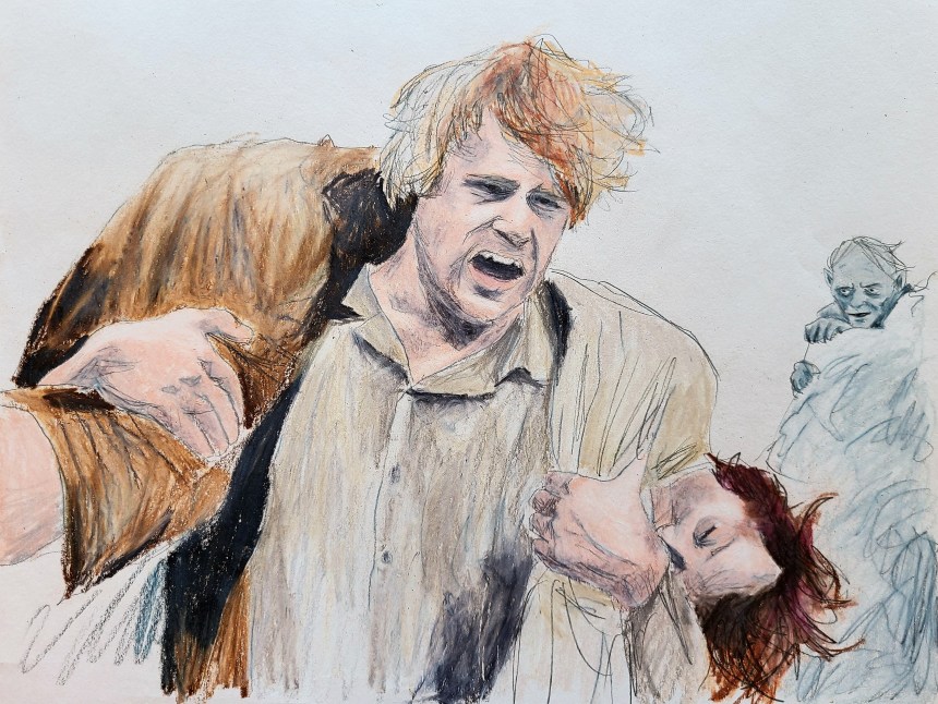
To start, I just browsed through the website and made note of everything that was noticeably worse than my recent uploads. I did not intend on doing so many initially, but the more I completed, the more I thought, “oh but I can do this one without also doing these.” It really snowballed on me, and I ended up rephotographing almost all of the art from around March 2018 to February 2019. I even had to do a fair amount of them multiple times until I was satisfied. All in all, it took several hours across two days, and I re-photographed, re-uploaded, and updated posts for 38 pieces! Quite a project, but I’m very glad I did it. I feel much better about them now. Since they’re already uploaded here on WordPress, I’m just going to throw some of the new versions into a gallery at the end of the post.

With this second project complete, a third project presented itself! Don’t you just love how that happens? Tasks spawning new tasks to infinity. Anyhow, seeing all these improved digital images immediately made me think about Pencils and Process again. Although the varying beige background shades make for a pretty cool looking mosaic on the cover, now I find myself unsatisfied with some of the images I included in the book. They were clear and sharp, yes, but the color needed work.
Unfortunately, there are a few instances that I can’t update. These were given away as gifts, so I’ll just have to deal with the not-exactly-white backgrounds on those. But I’ve almost finished updating the images already! I’ll still need to then upload the manuscripts to both Amazon’s KDP and IngramSpark, then let them review the changes. And I’ll need to update the Kindle ebook, which is an entirely different process. So there are still some steps to go to complete the book update. But I will certainly feel satisfied once it’s all done!
UPDATE EDIT: This third project is done! I ran into a couple hiccups, like my footers jumping around when I converted my manuscript to .pdf to upload it into KDP. And the images just wouldn’t cooperate with me in Kindle Create; I had to copy images into paint from the manuscript and re-save, rather than upload the original raw files. Regardless, the ebook, hardcover (Ingram), and paperback (KDP and Ingram) are all updated and live with the fresh new images! Feels good to have finished that for sure.


Pingback: New Product and Game Review Site 'Armdog Reviews' - Amdall Gallery
Pingback: Meme Art, Sergeant Mittens is Ready | Amdall Gallery
Like you, Jon, I’ve looked back at much of what I’ve photographed in the past and reviewed my seemingly ongoing struggle to get even light across a whole composition. To add to it, I’m also often photographing 3 dimensional objects and books.
At the beginning of this year I finally purchased a large (80cm square) portable photo booth with adjustable lighting, various ‘portholes’ to aim through and 3 different colour backgrounds. It’s been a Godsend. I can’t say that I’ve wrinkled out all my issues as I’m still coming to grips with it but my pictures are much improved. I use a small easel to stand items upright and have just started experimenting with vignettes laid flat.
An online course I’ve just started recommends using an iphone and certain apps which manipulate and improve photos but the struggles I see people experiencing keeps me with my wonderful Canon camera firmly in hand. I download and manipulate as little as possible (if at all if I’ve used the photo booth) in Photoshop, mainly resizing for web use.
I’ve also found a huge difference in the 2 computer screens I toggle between. Both the same brand and size, settings the same but oriented at different angles on my corner desk. I really have to ensure I’m looking at the right angle for each because imagery can seem very different if you’re not fully head on in front of the screen.
It’s no longer just about the art, is it? We’ve moved into the complexity of displaying the art, and I find that can take just about as long as producing the piece in the first place sometimes.
This is quite a timely comment – I’ve been trying to figure out the “ins and outs” of just such a thing. I’m not a photographer by any means, so all of this stuff takes some effort to wrap my brain around.
If you don’t mind sharing, what brand/model of photo booth/light box did you buy? It sounds like it’s been great, so you would recommend the one you’re using? Honestly, looking over options is a bit daunting because 1) I don’t actually know how to judge them and 2) the price seems to vary wildly. By way of example, here are two I was looking at:
https://www.amazon.com/dp/B01GIL6EU4
https://www.amazon.com/dp/B0798DMM35
Is the $141 so much better than the $65 one? I have no clue! There are reviews of course, but when they’re both a mixed back, I’m back to square one.
You are sure right about the complexity of displaying art though. Since most of the audience are viewing what we create digitally, it’s pretty much vital to present it well. Definitely not something I expected to be such a core component of the process!